our kitchen
This post is written without sponsorship, links are affiliated where possible meaning I earn an incremental amount (typically 1-3%) when a purchase is made.
After much back and forth we decided to give some love to our kitchen/dining room. It’s a large space running across the back of the house and just shy of 11 metres long. Considering how long it is it’s not all that wide at 4 metres. We didn’t do the knock through, (it was originally 3 rooms) helpfully the previous owners had done that bit.
Having lived in it for year we’ve realised it’s got its quirks... We wouldn’t have chosen the kitchen cabinets and it’s not been laid out very well. I’d love to put a timber kitchen in but while we decide whether this is our forever home my dream of having brass pot taps and a parlour cupboard won’t be coming to fruition…
The whole room was desperately in need of a lick of paint; as the busiest room in the house with constant daily traffic it was getting a bit grubby. I couldn’t look at the ceilings any more, as I showed on my Instagram the paintwork was pretty comical - any way, long story short we decided to get going and put some life back into the room and make it ours…
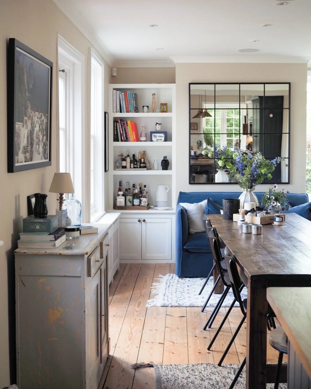
paint, Farrow and Ball / soap, Diptyque / gardeners hand cream, L’Occitane / candelabra sketch, Sarah Lewis / drying mat, Ralph Lauren via TK Maxx / black mirror, Maison du Monde / tool box was my great grandfather’s, Alexander Hart :)
We changed the handles from a pretty vulgar copper (more of a rose gold actually, apologies to anyone who has this but its just not my thing) to an antique brass which instantly toned things down.
As the kitchen is a standard one from Wren Kitchens and it was a doddle to replace things as our kitchen was on file, the handles being one of the things we needed for about £200. The previous owners also took all the drawer inserts, so we got new ones sorted out easily the same way. They did however leave some fetching rose gold light fittings to match the previous handles which we changed for ones from Pooky Lights. Changing the colour of the metalwork is something I didn’t think would make the amount of difference it did, I started liking the kitchen once we’d done it.
For now we’ve kept the tiling, but I’m itching to change it to some delft style ones I’ve seen at Fired Earth here (there are some much cheaper ones at Topps Tiles but I got samples and they all arrived cracked whereas the FE ones were fine so I’m taking that as a sign I should pay more for the quality)… Any way I digress…
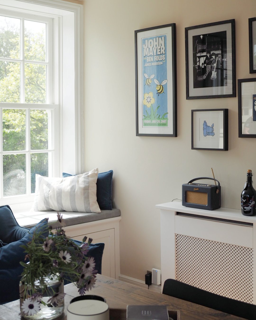
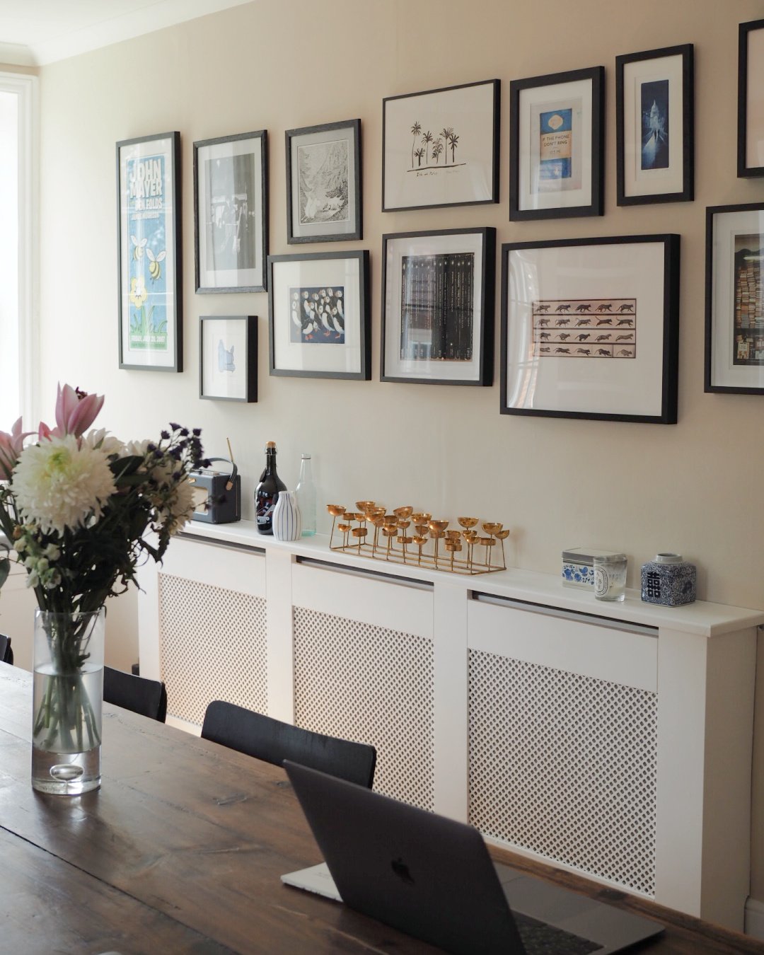
Structurally we didn’t have to do anything, but we added the cabinets in the dining area to give us shelving storage and a window nook (which the dog loves). We also had the radiator covers made by a local carpenter as they weren’t custom sized.
In the future we’d like to put in underfloor heating in this room, replacing the wooden floors at the same time. As lovely as they look they’re not practical for a kitchen space as with all the will in the world you can’t stop things (including food and most relevantly at the moment, tablets for the dog) disappearing between the boards. We considered staining them a less-orange tone but decided against adding it to the workload as we know we’ll change them at some point.
Paint wise after much deliberation we went with Farrow and Ball’s Joa’s White. It’s lighter than I thought we’d go for but having painted 3 or 4 shades around various spots in the room we settled on it. I really love it, considering how neutral it is as a colour it gives off so much warmth and somehow softens the darkness of the blue kitchen which had felt so stark against the formerly white walls. For the woodwork we went with Craig and Rose’s Craftsman’s White and the ceilings are in Lick’s White 03 - both of which we’ve used throughout the house for consistency.
Furniture wise we started from scratch, nothing except the mirror (from Maison Du Monde) and one of the rugs (the blue and jute one, from Ikea) came from the last house.
I knew I wanted a very big table for the dining room but gulped at the prices of some of the big oak tables I looked at. I realised that if I paid a few thousand pounds for a table I was going to be very, very precious about it and we wanted to create a very laid back space. So, I set about on a search for either a second hand one or a cheaper option via eBay and finally found our one. It was £300 and is made from old floorboards. It’s by no means as polished as some, but we love that we can be really chilled about marks or nicks in it. At some point we’ll stain the wood something a bit lighter, but whilst we have the flooring we do we wanted it to stand out from the colour of the other woodwork.
The dining room chairs were another hack, bought from eBay. They were school chairs (there are 12 of them, we keep the extras in the cellar) and originally metal and orange-wood. I spray painted them black (and sealed them with this to ensure no stains) to bring balance with the mirror and the picture frames. I really love them, and we got the whole lot, and painted them, for under £150 which was less than one of the Eames chairs I was originally looking at!
Another bargain were our bar stools, £20 each from B&Q here. They were meant to be a temporary thing but I really like them!
The sofa (actually a sofa bed) is from Love Your Home from their Sophie range. I knew I wanted blue to balance out the room with the kitchen, and the loose covers and easy velvet mean we can fling them in the wash when we need to. It is very, very heavy so I’m not sure it’ll ever live anywhere else. Couldn’t believe it when it arrived! It’s so far proven to be excellent with all kinds of stains and very comfortable to sleep on according to guests. We have a few pieces from Love Your Home and absolutely love them all.
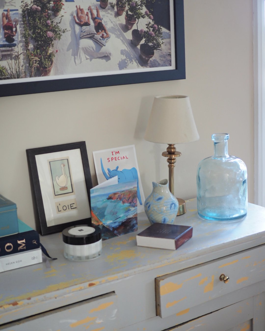
The old, grey wooden cabinet was a find in a market. The original plan was to strip it and either have it wooden or paint it white but we’ve come to really like it as it is. I changed the drawer knobs with some from IKEA, sanded down the grubby bits and filled in some holes and it’s become a favourite. The light on it is from Pooky, it’s a wireless one as the isn’t a socket nearby - just one of the gazillion ways those lights are helpful!
slim arrons print, Etsy / vase, Anthropologie / glass vase, TK Maxx / rhino print, David Shrigley / light, Pooky Lights
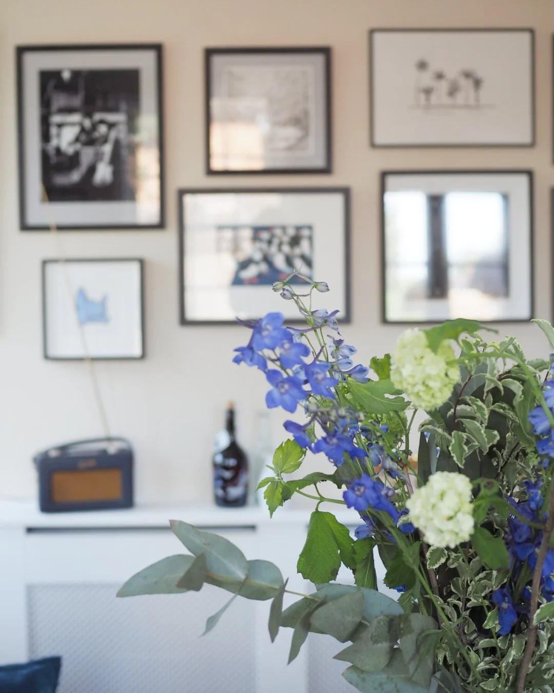
Artwork was a big thing for us in this space as the dining room has a big, open wall space. We worked with Affordable Art (a blog post all about the project is on their website here) to help us find stuff, alongside some bits we already owned. I’ve done a bigger post on how I’ve found things for the walls over the years, here.
Some favourite bits include my Babak Ganjeh postcards in the corner by the bookcase (a steal of a way to get some of his work, whilst I save for a bigger one), our Slim Arrons print from Etsy, my Muybridge cat photograph that I bought in the Royal Academy gift shop for £10 and then our lovely puffins from Affordable Art. A real mix of types, prices and styles but all come together as we stuck to the same colours as the rest of the room.
I really can’t believe the difference some tweaks and a tin of paint (okay, four tins) has made. Keeping the colours the same throughout has really connected the space, before it felt like the kitchen and dining spaces didn’t gel together at all. We’re really happy with it. Thank you for reading, and where I can remember I’ve linked to all the objects in the photographs beneath the photos themselves!


